
Simplified design process, boosted productivity, and reduced frustration.
Redefining Figma's tab experience 🚀
Managing multiple tabs in Figma is crucial for UX/UI designers juggling various projects. In this case study, I dive into a common usability challenge—navigating a crowded tab interface—and present a user-friendly solution that enhances both organization and accessibility. Discover how tab grouping and a scrollable header transform the workflow, ensuring seamless productivity for designers everywhere.
Explore the process, insights, and impact of this enhancement, designed to make your Figma experience more efficient and intuitive.
Company
Figma (I was not asked from figma to work on this 😂)
Industry
Design Services
Role
UX Designer
Researcher
Duration
1 Week
Tools used

The Problem
While working on various projects, I noticed a recurring pain point: tabs piling up, the essential '+' button disappearing, and the workflow getting disrupted.
Solution
By performing the design thinking methodologies, I redesigned Figma’s tabs experience to tackle these issues head-on:
Tab Grouping:
Users can easily group tabs with labels and color codes to keep their workspace organized.
Scrollable Tabs Header:
Ensures the '+' button remains accessible, no matter how many tabs you have open.
This user-friendly enhancement follows key UX principles, aiming to streamline your design process and boost productivity.
Note: I tried solving these issues on behalf of many users' pain points and their suggestions based on various user testing sessions with them.
I solved the problem that the actual users are talking about.
The problem was raised with me, but when I dug deeper into user research, I found this is not the pain point of one user (me) but many other UX designers (Figma's core users) sharing the same pain point over the internet and individual chats.


Design Exploration
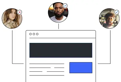
User Testing
After designing the solution, I validated the usability of the Tab grouping and scroll feature and functionality with real users (primarily as UX designers). I conducted rigorous testing with diverse participants and analyzed the results to identify areas for improvement. I created a test plan and followed the user testing process. I aim to show how user feedback informed our design decisions.
The Results
Impact users felt
This enhancement simplifies the design process, reduces frustration, and boosts overall productivity—proving that even small changes can make a big impact.
Simplify design process
Reduced fraustration
Boost overall productivity
Impressed?
Are you impressed with my experience in UI/UX designing?
Shoot an email to sri1996gaurav@gmail.com