
Boosted platform engagement rate by 25%.
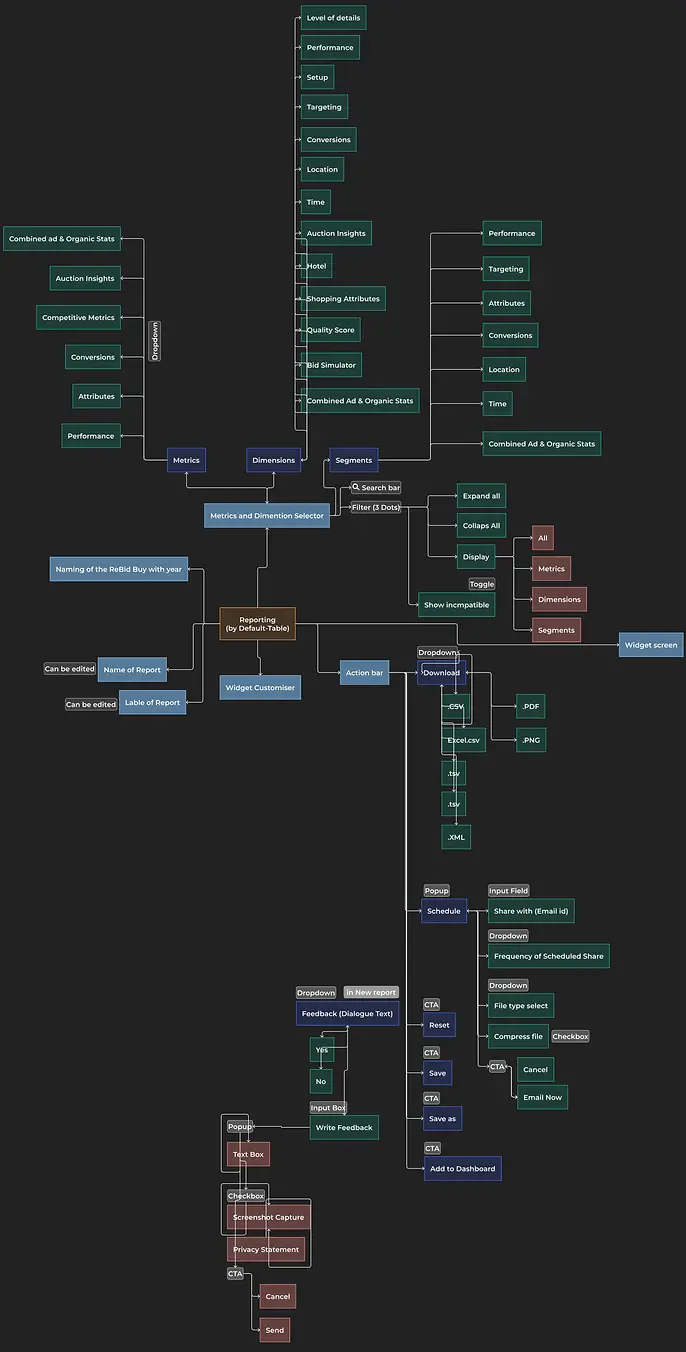
A Redesigned Customizable Dashboard with Advanced Features and Functionalities
Redesigned a customizable marketing dashboard with real-time data, personalized widgets, and custom reports, enhancing user experience through improved onboarding, simplified navigation, and a user-friendly interface with intuitive filters. This redesign aligned with both user-centered design principles and business objectives, resulting in a 40% reduction in client onboarding time, a 25% boost in platform engagement, and a significant decrease in customer support requests. The streamlined interface and optimized user flows improved overall usability, ensuring a more efficient and satisfying user journey, ultimately driving higher engagement and enhancing the platform's effectiveness for its users.
Company
Leading AdTech Martech SaaS Company
Industry
AdTech | Martech
Role
Product Designer
Researcher
Duration
3 Weeks
Tools used
The Problem
The Old customizable dashboard for marketers was a problem as it limits their ability to fully customize Ad campaign reports, resulting in a lack of flexibility, power, and collaboration.

Research
User feedback matters! I spoke with users from client companies and our customer success team to create a better dashboard experience.
Customization
Users desire more flexibility and customization options in the dashboard, including the ability to apply metrics, dimensions, and customized chart types to their reports.
Usability
Users find the current dashboard interface confusing and difficult to navigate, and request a more user-friendly and intuitive design.
Collaboration
Users request the ability to take notes at both the dashboard and widget level, to better collaborate and share insights with team members.
Reporting
Users want the ability to export their custom reports in various formats (e.g. PDF, Excel) and access real-time data and analytics to make better decisions and optimize their Ad campaigns.
Research
Proposed Solution
Customization
Customization Enables users to create custom reports by selecting desired metrics, dimensions, and chart types.
Outcome
Allows for greater flexibility and customization options; helps users tailor reports to their specific needs and make more informed decisions.
Usability and Intuitiveness
Simplify the dashboard interface and use clear, consistent visual language; implement intuitive navigation features such as breadcrumb trails, search bars, and customizable shortcuts; use tooltips and pop-ups to guide users through the dashboard.
Outcome
Makes the dashboard more user-friendly and intuitive; helps users navigate the dashboard more easily and access the information they need quickly.
Collaboration and Sharing
Add a note-taking feature at both the dashboard and widget level; Enable real-time sharing and automated reports on email and WhatsApp.
Outcomes
Enables team collaboration and sharing of insights; improves communication and facilitates more efficient decision-making.
Make it easy to export custom reports in various formats; provide real-time data and analytics, with up-to-the-minute information on ad performance; implement notifications and alerts to keep users informed of important changes in real-time.
Outcome
Provides users with greater insights into their campaign performance; helps identify areas for improvement and optimize Ad campaigns.
Reporting and Real-Time Data
Conclusion
To redesign the customizable dashboard for marketers, proposed solutions such as customization, usability/intuitiveness, collaboration and sharing, and reporting and real-time data can address the existing issues. Each solution has its own advantages and drawbacks that need to be considered. A comprehensive UX design approach is necessary to implement the most effective solutions and create a user-friendly dashboard.
User Journey
Key Solution Elements
Logging into the dashboard
Viewing real-time data and analytics for ad performance
Customizing the dashboard interface according to personal preferences
Adding notes and comments at both the dashboard and widget level for collaboration and sharing with team members
Creating custom reports by selecting desired metrics, dimensions, and chart types
Exporting custom reports in various formats
Receiving notifications and alerts for important changes in real-time.


Design Exploration
Information Archecture
The IA section showcases the structure and organization of the customizable dashboard for marketers. My design process involved careful consideration of user needs, design principles, and industry best practices to create a seamless and intuitive user experience. By presenting information architecture in this section, we aim to provide a clear understanding of how we approached the design of the dashboard's underlying structure and how it contributes to the overall user experience.
Design Exploration
User Testing
After designing the solution, I validated the usability of the customizable dashboard for marketers. I conducted rigorous testing with diverse participants and analyzed the results to identify areas for improvement. I created a test plan and followed the user testing process. I aim to show how user feedback informed our design decisions.
Widget Editor
Extra click to add filters
Users expressed frustration with the extra click required to add filters to the customizable dashboard, leading to a slower workflow and negative user experience. They suggested a more streamlined process to add filters without the need for extra clicks.
Report Preview
Inconsistent Experience
Users expected the same experience on the expanded view of the report widget, but it was not consistent, leading to confusion and a lack of trust in the platform.
Dashboard level Widget
Confusing Descriptions
Users were able to add descriptions on the widget level, but were not able to see them on the dashboard level widgets, leading to confusion and frustration.
Reports Dashboard
Lack of Presentation Mode
Users often presented the data and reports on big screens in presentation mode, but there was no button on the dashboard level to enable this, resulting in a suboptimal user experience.
Design Exploration
Improvement and Iteration
I addressed several key user testing results, including Filter application issues, inconsistent expanded view, confusing widget descriptions, and missing presentation mode button on the dashboard. These improvements have greatly enhanced the user experience, making the platform more intuitive and user-friendly.

Improved filter functionality
To address the user testing result around the extra click for filters, I made improvements to the filter functionality. Users can now easily add multiple filters at once from the dashboard and widget level without the need for an additional click, making the process more streamlined and intuitive. This enhancement has greatly improved the user experience by saving time and reducing frustration.

Handoff
Design Handoff
I worked closely with engineers to validate the design and copy implementation. Along with daily standups, we also had daily demos and would occasionally sit together and cross-check implementation with final designs.
The Results
Business Impact
The redesign of our marketing reporting platform had a substantial positive impact on our business, resulting in increased user engagement, decreased user churn, improved user satisfaction, and increased revenue through the acquisition of new enterprise clients.
25%
Increased user engagement
After implementing the new design, we saw a 30% increase in the average time users spent on the platform.
15 Points
Improved NPS Score
Our NPS score for customer experience has increased by I5 points
40%
Reduced support costs
With the new design, we saw a 40% decrease in support tickets related to navigation and usability issues.
+2
New Client Onboarding
We onboarded 2 new enterprise clients looking for a customizable dashboard, resulting in increased revenue.
Impressed?
Are you impressed with my experience in UI/UX designing?
Shoot an email to sri1996gaurav@gmail.com